Picking the right color for your storefront isn’t just a design choice—it’s a strategic move that could mean the difference between drawing in foot traffic or blending into the background. When it comes to commercial exterior painting, think of it not just as a layer of protection but as a visual handshake with every potential customer who walks or drives by.
This guide breaks down how to choose the top paint colors for storefronts that turn heads and strengthen your brand’s identity.
Key Takeaways:
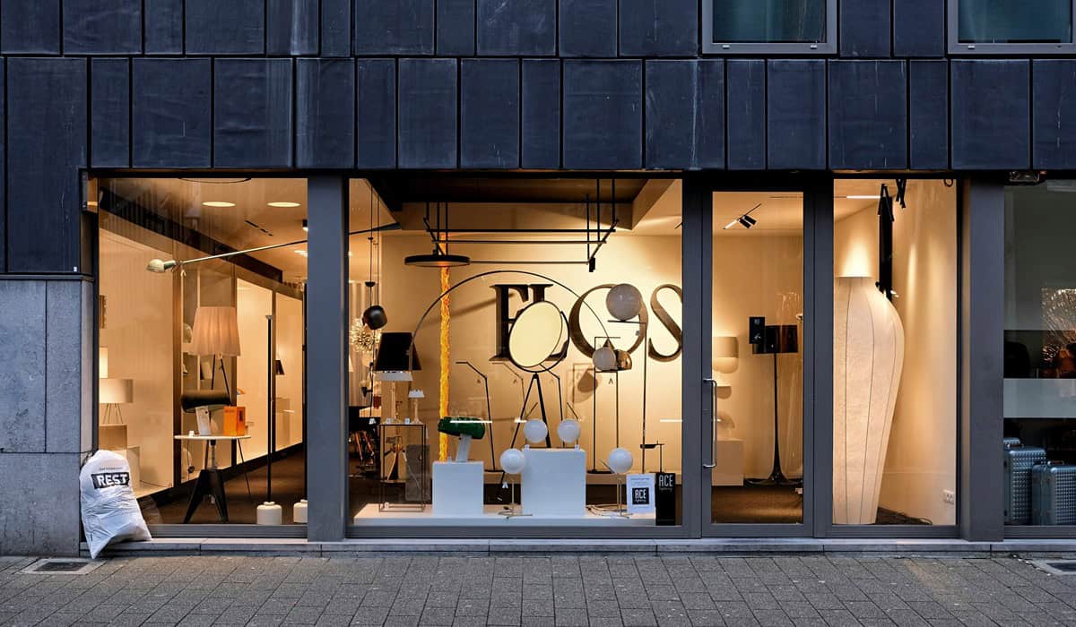
Why Color Is a Big Deal for Your Storefront
Think of your storefront as your brand’s billboard. It’s not just about slapping on a fresh coat—it’s about sending a message. Whether you want to convey trust, energy, luxury, or friendliness, color plays a huge role in how people perceive your business. Go with the wrong shade, and you risk looking outdated or uninviting.
The Psychology Behind Paint Colors
Colors aren’t just decorative—they communicate. The shades you choose send subtle signals to everyone who sees them, influencing how people feel about your business before they even step inside. Picking the right palette is about more than just aesthetics; it’s about choosing colors that speak to your brand’s core values.
Here’s a quick look at what different colors tend to convey:
Color Psychology for Storefronts
Red
Sparks urgency, energy, and excitement. It's bold and attention-grabbing, perfect for promotions or high-energy brands.
Blue
Conveys trust, reliability, and calm. Frequently used by banks, tech firms, and wellness centers.
Yellow
Radiates cheerfulness and optimism. Great for fun, youthful brands that want to appear friendly and inviting.
Green
Suggests health, eco-friendliness, and tranquility. Ideal for organic shops, spas, or anything nature-inspired.
Orange
Energetic and enthusiastic, orange grabs attention without being as intense as red. Often used for brands that want to appear creative and fun.
Black
Symbolizes sophistication, luxury, and authority. When used right, it can make a storefront look upscale and modern.
White
Clean, simple, and minimal. Great for brands that want to showcase purity or spaciousness.
How Climate and Location Come Into Play
Don’t underestimate how much your zip code affects your paint choice. In hot, sunny areas, light colors help reflect heat and keep things cool. Colder regions? Darker tones can give off warmth and make your storefront feel cozy. Also, think about the neighborhood vibe. You want your business to pop without clashing with the local aesthetic.
Trendy Storefront Colors Right Now
While neutrals like white, beige, and gray never go out of style, bolder choices are making waves in the world of storefront design. Business owners are stepping out of the safe zone and opting for colors that make a statement and reflect a more modern, dynamic brand identity.
Popular trending colors include:
1. Deep Navy
A sophisticated, professional color that feels both modern and trustworthy. Think IBM or PayPal, which use deep blues to signal stability and professionalism. A close match is Sherwin-Williams’ “Naval SW 6244,” a popular deep navy used in modern commercial designs.

2. Rich Forest Green
Earthy and calming, this shade suggests growth, sustainability, and elegance. Whole Foods and Land Rover both tap into this color to convey natural reliability and environmental consciousness. For a paint match, Sherwin-Williams’ “Rookwood Dark Green SW 2816” captures this vibe well.
3. Matte Black
Bold and upscale, black storefronts create a sleek, urban edge that turns heads. Brands like Apple and Chanel use black to reflect luxury and minimalist modernity. Consider using Sherwin-Williams’ “Tricorn Black SW 6258”—a rich, deep black perfect for storefront elegance.

Another rising trend is color blocking—combining contrasting yet complementary colors to add visual intrigue and help different architectural features stand out.
Match Your Colors to Your Brand
Your brand’s personality should guide your color picks. A cutting-edge startup might lean into crisp grays with a neon accent, while a boutique might go for soft, inviting pastels. And don’t forget to tie your exterior look into your interior design and signage. It’s all about creating a seamless brand experience.
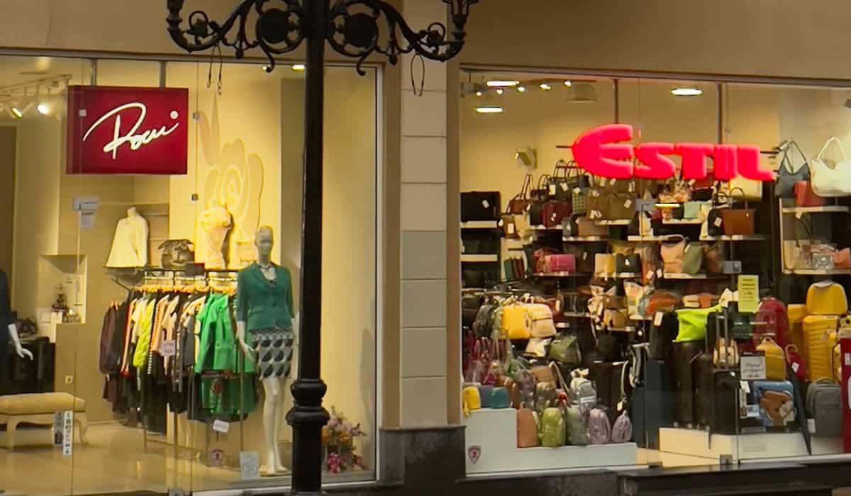
Common Pitfalls to Avoid
Even with the best intentions, it’s easy to stumble when picking paint colors for your storefront. Here are some common missteps to keep on your radar:
Just because a color is trending doesn’t mean it aligns with your business’s personality. Jumping on a fad can backfire if it doesn’t resonate with your target audience or feels out of place.
Some shades, especially light neutrals, tend to show every speck of dirt, dust, and smudge. This means more frequent cleaning or risk looking neglected.
Many areas have strict guidelines about what you can and can’t do with your building’s exterior. Skipping this step could lead to fines or forced repaints.
Even the best color can fall flat if it’s applied over an unprepared surface or with low-quality paint. You’ll end up with peeling, fading, or a finish that just doesn’t last.
Why Hiring Pros Is Worth It
Bringing in experts in commercial exterior painting can be a game-changer. They’ll help you choose durable, high-quality paints, prep the surface the right way, and deliver a flawless finish. Plus, they’ll keep the project on track—no mess, no stress.
Let’s Get That Storefront Noticed!
Picking the top paint colors for storefronts isn’t just about style—it’s about strategy. The right color palette can elevate your business, boost foot traffic, and reinforce your brand. Ready to make a splash? Call H&H Painting Co. at 269-748-0933. We’ll help you turn your storefront into a standout.
